

myCoke Campaigns
elevating email and banner designs through a B2B lens
OVERVIEW
The myCoke Campaign project consisted of designing e-mails and banners for the myCoke site and the bottlers who utilize it, a B2B approach as opposed to the existing campaigns aimed for consumers. Featuring new products and delivering channel-specific insights to keep the bottlers up to date regarding the latest and exactly where to order from.
Client: The Coca-Cola Company
Timeframe: Winter 2024 - Summer 2025
MY ROLE – LEAD UX/UI DESIGNER
As the UX/UI Designer on this project, my main task was working on email and banner creatives. But also collaborating with project managers and designers from the very beginning to streamline workflows and establish efficient processes. My contributions include building components for the design library and creating reusable email templates to support ongoing campaigns.
My design responsibilities also involved making sure brand guidelines and creative guardrails were consistently applied across all deliverables, as well as checking accessibility requirements to ensure inclusivity. Additionally, I explored ways to enhance the visual design of emails, introducing creative solutions to break away from the more traditional "boxy" layout approach and bring more variety and interest to the designs.
SKILLS & TOOLS
We overhauled the campaign design process by elevating quality and building scalable systems. Email and banner templates were redesigned for accessibility, best-in-class practices, and brand alignment. A component-based Figma system and export guidelines streamlined production and ensured developers received pixel-perfect, performance-optimized files.
Solution
Problem
Coca-Cola’s B2B marketing teams needed to deliver high volumes of responsive emails and banners across multiple bottlers and sub-brands. The existing assets were from a third-party vendor and showed poor visual execution and weak email best practices. Asset delivery also lacked structure, and developer handoff often required extra effort to fix errors or clarify design intent.
Campaign Needs
For each campaign, we had to design both Banners for the myCoke website, and Emails that were being sent to the bottlers.
A lot of aspects called for different variations of these assets, such as: Products, Channels, Target Markets, Languages, Packaging and Adapts. Most times we found ourselves having to create assets for both US and Canada, both with different messaging and in their respective languages.

The Process
This was the timeline for each of the campaigns we worked on. It was a joint effort of our project managers, the creative team, and the developers to ensure that the workflow was streamlined and deliverables were handed off on time.
Project Managers receive campaign assets and upload to Sharepoint
Figma file for campaign is set up with banner & email templates and assets
Kickoff meeting is scheduled and we do a campaign brief walkthrough
Copy and Design team start creating the campaign deliverables
First review with internal team to show designs and copy
Meeting with client to showcase emails & banners
Canada versions are made, and French translations are received
Export as PDFs and sent to legal team for approval
Once approved, final exports of banners and emails are packaged up
Final deliverables are sent to developers to start implementing
Deliverables

Banners
The banners typically were 9 standard sizes, from desktop to mobile, to ensure responsiveness on the site.
Since we handled a lot of campaigns, keeping them carefully labeled was imperative. We created blank templates to start off of for each new campaign, so we had a Figma file we could duplicate and build onto.
Emails
The emails were made up of the components we designed, to achieve a more templatized approach and give developers all the tools needed to work.
Despite the templates being very basic initially, you could mix and match components and really push the 'stacked' layout boundaries to create a good email design that flows nicely and incorporates the campaign's creative.

Component Library
For the emails in particular, we created a Component Library full of assets we could use to build each email. Since this was a large scale project with a lot of campaigns, it was in our best interest to make things as easy as we could both on us the designers, and the developers alike. Additionally, to avoid too much repetition and risk emails looking the same, we made sure to create components with different designs for the purpose of switching things up.

Example of Component Library Page

Organization

Type Styles

Color Palette

The Highlights
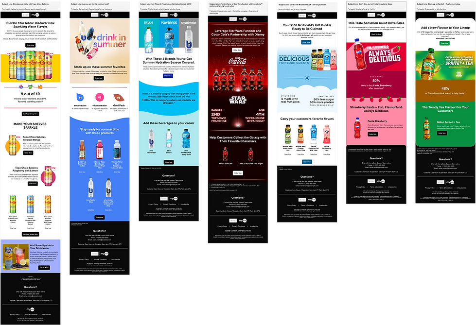
Here's a selection of final deliverables that showcase the strongest creative solutions and some of the client's favorites across different campaigns.

Banners


Emails
Learnings & Reflections
Pushing the boundaries of email design
Emails don't have to be boring. The idea was to build a component library with a lot of pieces that we could mix and match, and truly try to break the 'boxy' layout approach to better integrate the branding.
Juggling multiple campaigns and deliverables at once
This was a very fast paced project with a lot of campaigns going out to client each week, and a very small design team where I was the main designer, Meaning I had to really learn to divvy up my time in a smart way and streamline my work process to meet all the deadlines.
Communication with team and project managers
I learnt how crucial it is to be able to communicate and rely on the rest of my teammates on such a big-scale project with multiple different streams. Whenever we needed to push on a deadline, or change something about the way we worked to improve efficiency, I was able to speak up and chat with the team to ensure things were flowing properly.