

Ditch
helping users ditch their debt, for good.
OVERVIEW
Ditch's goal is to help users pay off debt, by turning everyday spend into automated payments, making progress in an effortless way. Giving users the tools to track both spending and debt in one place, and featuring an integrated AI assistant that helps guide users along their financial journey.
At its core, Ditch is all about accountability: lifting the burden of being on top of their debt payment so people can focus on what matters most in their lives.
Client: Ditch
Timeframe: Spring 2026
MY ROLE – PRODUCT DESIGNER
I joined Ditch as a contract Product Designer, working closely with the Product Manager to shape the product's direction and partnering with engineers throughout handoff to ensure design intent translated accurately into the final build.
My core focus was building Ditch's first Component Library from the ground up, establishing a scalable design system the team didn't previously have. Alongside this, I contributed to new feature design end-to-end, from early ideation and research through to handoff. I also audited existing screens and flows, flagging inconsistencies and redesigning where needed, and refined spacing, padding, and layout specs across the app to bring greater visual and structural consistency to the overall product experience.
SKILLS & TOOLS
Over my time at Ditch, I worked across several major initiatives. This case study walks through them in order of impact, starting with the foundational design system and moving into feature work.
Building Ditch's Design System
Beyond my core UX/UI responsibilities as the main Product Designer on the team, I took on an ongoing project of my own: building Ditch's first real Design System. At the time, there was no established component library — just scattered, one-off components across the Figma file, which led to visual inconsistencies and wasted time rebuilding the same elements for different screens.
I audited the entire file, consolidated the stray components, and established clear rules for consistency across the product. From there, I rebuilt each one as a proper component with the variables and properties needed to make it modular and adaptable across use cases. Before leaving the team, I documented usage instructions for every component and walked the team through the finished library so they could carry it forward on their own.
-
No existing design system, just stray components and screens with grouped elements
-
Inconsistent layout specs and visual design across the product
-
Lack of reusable components slowed down the Figma workflow
-
Elements and screens that didn't meet accessibility requirements
Current Situation
-
Reviewed the Figma file, compiling and consolidating all existing elements
-
Rebuilt them as proper components, with the variables and properties needed to make them modular and adaptable across use cases
-
Organized the file by component type, with clear descriptions and usage instructions
-
Compiled standard accessibility notes for easy reference while designing, and updated any elements that didn't yet meet those standards
The Gameplan
-
A proper, organized, scalable component library for the team to use going forward, streamlining the design process in Figma
-
Components with multiple variables, editable in various ways for modularity
-
A source-of-truth document for designers and engineers to maintain consistency across the application's specs and visuals
Final Outcome

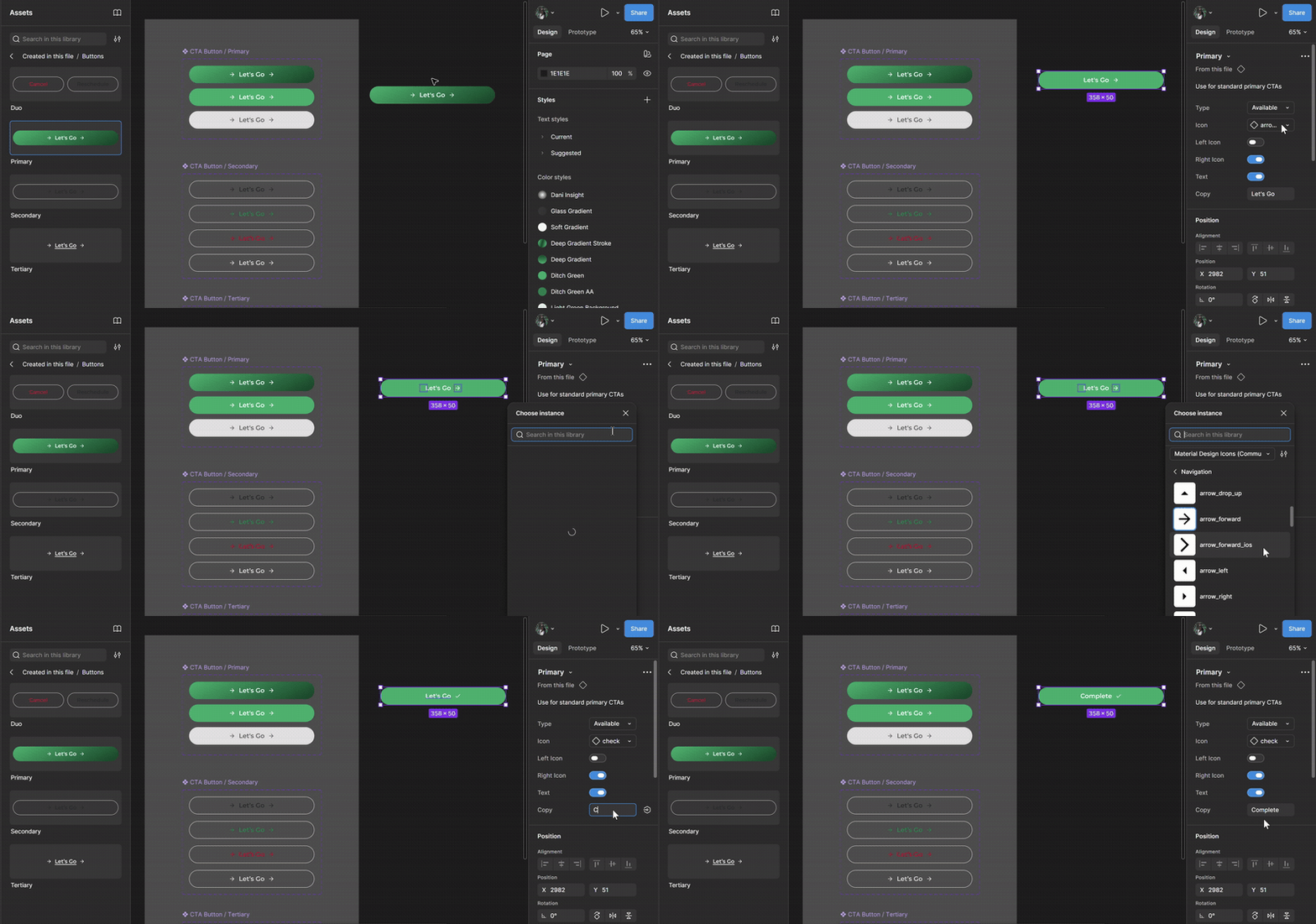
A short demonstration of toggling properties, switching variables, and updating copy for different use cases, showing how a single component stays modular and adaptable.
Components in Action
The Process of Ideating for New Features
Another responsibility I took on was defining a proper design process for developing new features, one that could take an idea from concept to a real, shippable product. We used this process for a new feature we were considering to reward users, and it worked well enough that we knew exactly where to invest more or less time on the next feature: Manual Micro-Payments, which came with a much tighter deadline.
Rewards Program
Encourage exploration of Ditch's features and reward them for it
Drive re-engagement and keep users motivated throughout their debt repayment journey
Turn users into advocates through friend referrals


GOALS

Manual Micro-Payments
Give users more agency and flexibility to make manual payments
Increase fee capture opportunities to boost retention
Help users hit their goals faster and feel a real sense of accomplishment in their payoff journey


GOALS
The Design Process
-
Hi-fi wireframes
-
Animation considerations
-
Developer notes and handoff
DELIVERING
DISCOVERY
DEFINING
DESIGNING
-
Starter Thoughts
-
Initial Research
-
Competitive Analysis
-
Gathering Inspiration
-
Initial Flow
-
Define MVP, nice to have's and future considerations
-
Map user clusters
-
Outline features
-
Lo-fi Wireframes
-
Visual Exploration
-
Optimize flows
-
Check in with broader team

Exploring Visual Direction and Layouts
For the Rewards Program specifically, we needed new components, new icons, and a distinct visual identity to set it apart from the rest of the app. That's why even the proposed flows explored different looks, so the team could weigh in and react to real variants. Manual Micro-Payments was more straightforward, since it relied on our existing visual language; the main task was figuring out the best approach from a UX perspective.

Polished Screens. Final Look.
Manual Micro-Payments had a quicker turnaround than Rewards and was prioritized for the next version release, so after incorporating feedback from the team and locking in the final flow, we arrived at the high-fidelity screens (shown below) ready for developer handoff.
The Rewards Program, meanwhile, was moved to the backlog, the team wanted to prioritize other initiatives and fully review the legal considerations around giveaways before implementation. It hasn't shipped as of this writing, but the research and design groundwork remains ready to pick back up.
Key Screens from Manual Micro-Payments Final Flow
INITIAL SCREEN
AMOUNT INPUT
REVIEW PAYMENT
SUCCESSFUL PAYMENT
GOAL PROGRESS

Reevaluating and Redesigning
A significant part of my work at Ditch was revisiting and redesigning existing screens, from small quality-of-life updates to full flow rethinks. The goal throughout was to keep the experience as intuitive, informative, and frictionless as possible for old and new users.
-
Updated the visual language to match the changes rolled out across the rest of the app for consistency
-
Made the visuals more intuitive and easier to understand at a glance
-
Redesigned the streak screen to better match the original vision for it
First Payoff & Streaks
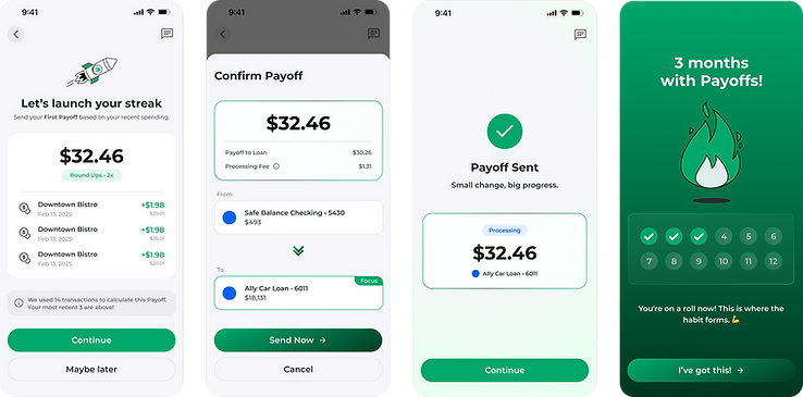
REDESIGN
CHANGES
-
Tightened and added copy where needed
-
Updated the visual language to the new system
-
Kept the visual language cohesive
-
Cut unnecessary copy
-
Made the visuals clearer about what's happening
-
Added a universal green checkmark to signal a successful action
-
Kept visual language cohesive and copy tight
-
Leaned into fire imagery for streaks
-
Tighten copy within streak marker and make it resemble a punch card

OLD DESIGN
-
Broke up the steps to add breathing room and more intention between each one
-
Added educational information to guide users toward the ideal solution
-
Began implementing and creating new components for this flow
Loan Marketplace

Learnings & Reflections
Building an entire component library by myself
I've designed component libraries before, but always at a smaller scale, whether it's been for a specific campaign, or as part of a larger effort shared with at least one other designer. This was my first time owning the creation of a full design system solo, and I learned a lot from it, especially regarding the amount of time and care it takes to make components that are truly functional & modular for future use.
Being in a fast-paced startup environment
Most of my experience comes from working at a large-scale agency, so it was great to return to a startup environment and experience that dynamic again. Working with a small, tight-knit team where everyone is cross-collaborative and has insight and input into the work.
Knowing what and when to prioritize
Given the fast pace of the environment and the need to ship with a short turnaround most of the time, I learned how to spend my time in a way that kept deliverables at a high quality while still hitting deadlines.